Shell Scheme Exhibition Stands Explained
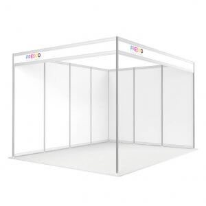
Shell scheme exhibition stands are a standard booth structure supplied by exhibition organisers at trade shows and events. While the aluminium frame and wall panels are included as part of your space, the graphics and branding are not – leaving exhibitors with a blank canvas.
Fresco designs and manufactures shell scheme graphics in the UK, including our ShowSuit® fabric system and ShellGraphic panel graphics. Both are built to fit standard shell scheme walls, giving exhibitors practical options to suit different schedules, transport methods and budgets.
What is a shell scheme exhibition stand?
A shell scheme is a modular exhibition stand system made up of aluminium poles and infill wall panels, typically supplied in standard widths such as 3m, 4m or 5m. The structure itself is generic, meaning every exhibitor starts with the same framework and layout.
To personalise a shell scheme, exhibitors add printed graphics that fix to the shell scheme walls, covering the panels and creating a branded backdrop for the stand.
How do shell scheme graphics work?
Shell scheme graphics are printed displays designed to work with the organiser-supplied shell scheme framework, fitting neatly within the aluminium structure to create a branded backdrop for the stand.
Different shell scheme graphic systems attach in different ways:
Panel-based graphics, such as ShellGraphic, use printed PVC panels that fix directly to the shell scheme wall panels using hook-and-loop (Velcro) fastening. Each panel is sized to fit between the aluminium uprights, allowing exhibitors to line their stand wall-by-wall with individual graphics.
Fabric wall systems, such as ShowSuit®, attach to the shell scheme structure itself. Tensioned fabric graphics are fixed to the aluminium framework, creating one continuous display across the stand with no visible panel joins.
Both approaches are designed to work with standard shell scheme layouts and allow exhibitors to achieve a clean, professional finish without modifying or replacing the organiser’s shell scheme.
Fabric shell scheme graphics
Fresco supplies fabric-based shell scheme graphics, offering different solutions depending on how often you exhibit and how you need your stand to work in practice.
Fabric graphics are lightweight, foldable and well suited to repeat exhibiting. They can be packed into compact carry bags, installed quickly on-site and reused across multiple events, making them a practical alternative to traditional rigid panel systems.
All Fresco fabric shell scheme graphics are manufactured in the UK by FRESCO, allowing us to maintain consistent quality, realistic lead times and ongoing support for returning exhibitors.
Which shell scheme graphics are right for you?
Fresco supplies both fabric and PVC shell scheme graphics, offering different solutions depending on how often you exhibit and how you need your stand to work in practice.
ShowSuit® Fabric System
A complete, reusable fabric system designed for exhibitors who attend multiple shows each year. ShowSuit uses tensioned fabric graphics to create a seamless display across shell scheme walls, with everything packing down into a single bag for easy transport and quick installation.
ShellGraphic Fabric Panels
Printed PVC panel graphics designed to fit neatly between standard shell scheme uprights. ShellGraphic offers a familiar, panel-based layout and is a cost-effective option for exhibitors who prefer traditional rigid panels while still achieving a clean, professional finish.
Both systems are sized to fit standard shell scheme wall dimensions and are supplied to work with organiser-provided shell scheme structures.
You can explore each option below to see which best suits your exhibition schedule, transport needs and budget.
Choosing the right shell scheme graphics
The most suitable shell scheme graphics depend on a number of factors, including:
• How often you exhibit
• Typical shell scheme wall sizes at your events
• Whether you travel by car, courier or public transport
• How quickly you need to install and dismantle
• Whether the graphics need to be reused across multiple exhibitions
If you are unsure which option is best for your stand, our team can advise based on how and where you exhibit.
UK manufacture and ongoing support
All Fresco shell scheme graphics are manufactured in the UK, allowing us to maintain quality control, offer realistic lead times and support repeat exhibitors year after year.
We also continue to support legacy systems — including Curvorama — with replacement parts and graphics available on request.
Next steps
If you already know what type of shell scheme graphics you need, you can view our full range below.
If not, feel free to get in touch and we’ll help you choose the most practical option for your stand and events calendar.

 01422 246634
